Tuesday, April 20, 2010

Nominal Area Choropleth Maps


A Nominal Choropleth map is a map that attempts to show qualitative descriptive geographical data. This is a map of Africa that labels every city within the continent.


Standardized Choropleth Map


A Standardized Choropleth map is a map that represents data on average. This map is a map of Canada and its average population represented by percentage.

Bivariate Choropleth Map


A bivariate map displays two variables on a single map by combining two different sets of graphic symbols or colors. A bivariate map is intended to convey the spatial distribution of two variables and the geographical concentration of their relationship. This map displays two different variables on the same map.


Unclassed Choropleth Map


An Unclassed Choropleth map is a map that represents values of birth rate by proportional degree of darkness.


Classed Choropleth Map


Classed Choropleth maps are better than unclassed, regardless of the symbol type used. Classed maps have a distinct and statistically significant advantage over unclassed choropleth maps. A classed choropleth map is a type of choropleth map that uses smaller intervals to portray the data. It is broken down into a scale and presented using colored intervals.


Range Graded Proportional Circle Map


A Range Graded Proportional Circle map is a map that arranges circles in relation to the data. This map, as decribed by the figure above, represents a range graded proportional circle map because it attempts to represent what the population would look like in the "real-world". The larger the circle, the larger the urban population.


Continuous Variable Proportional Circle Maps


A Continuously Variable Proportional Circle map is a proportional circle map that uses circles to create data points. The variables being measured relate to the size of the circle used. This map is a continuous proportional circle map that represents the data and proportion of the data according to circle size.


Accumulative Line Graph


An Accumulated Line graph (Lorenz curve) are line graphs that are "stacked" on top of each other. The graph can a representation of wealth. Lorenz curve shows the degree of inequality that exists in the distributions of two variables, and is often used to illustrate the extent that income or wealth are distributed unequally in a particular society. This map shows household income and spending.


Parallel Coordinate Graph


A Parallel Coordinate Graph is a graph that attempts to show multivariate structure of data by plotting all variables simultaneously. This is done by plotting each variable on a vertical axis, and then connecting together all points on the axes that correspond to a line as evident by this chosen graph.


Stem and Leaf Plot Map


A Stem and Leaf Plot is a type of graph similar to a histogram but shows more information. The Stem-and-Leaf Plot summarizes the distribution of data and provides extra detail regarding individual values. The data is arranged by place value. The digits in the largest place is referred to as the stem and the digits in the smallest place are referred to as the leaf. The leaves are always displayed to the left of the stem. This map is evident of a stem and leaf plot in that it has all its stems listed on the left and leaves listed on the right.


Similarity Matix


A Similarity matrix is a matrix of scores which express the similarity between two data points. Similarity matrices are related to their counterparts, distance matrices, and substitution matrices. This map is a similarity matrix because it brings different strains of bacteria together that resemble each other.


Dopplar Radar Map


A Dopplar Radar map is a map of the weather radar system that employs the apparent shift in frequency of radio waves to perceive air motion and consequently predict tornadoes and precipitation sooner than previous radars. It also measures the speed and direction of rain and ice. This map is a dopplar radar map because it shows movement of weather (Tropical Storm Alberto) across a region.


Correlation Matrix Maps


A Correlation Matrix graph is a graph that gives the correlations between all pairs of data sets.
In statistics, correlation and dependence are any of a broad class of statistical relationships between two or more random variables or observed data values. This map represents a correlation matrix because the correlation between two different sets of variables is shown. This map is a calculated protein correlation matrix in which the behaviors range from high (red) to low (blue).

Box Plot Maps


a box plot or boxplot (also known as a box-and-whisker diagram or plot) is a convenient way of graphically depicting groups of numerical data through their five-number summaries. This box plot is a box plot because it consists of one or more box symbols that summarizes the distribution of the data within one or more data sets. A Box Plot chart displays a rectangle with whisker lines extending from both ends.

Triangular Plot Maps


A Triangular Plot map is a map that displays three types of data with the total percentage equaling 100%. The three variables makes comparison easy. This map is a triangular plot map consisting of three variables that form into a triangle shape totalling 100%


Wind Rose Maps


A Wind Rose map is a map of a given locality or area, showing the frequency and strength of the wind from various directions. It is a meteorological diagram depicting the distribution of wind direction and speed at a location over a period of time. This map represents a wind rose map because it shows distribution of wind direction for the month of January over a 24 hour period. It shows the percentage of time the wind is blowing in a particular direction as shown by the rings in the figure. The colors show the percentage of time the wind speed is from that direction.


Climograph Maps


A Climograph map is a map that shows monthly average temperature plotted against average humidity (precipitation). The monthly points are joined by a line. The shape and location of line indicates the nature of climate in terms of heat and humidity. This map represents a climograph because it shows average temperature and precipitation over time as evidence by the use of the purple line that runs from January to December.


Index Value Plot Map


An Index Value map is a visualization without absolute values. It is normally plotted along a line graphe to show differences in the data. This graph is an Index value graph because it shows average stream flow for the United States as plotted along a line graph showing.


Scatter Plot Map


A Scatter plot map is a map that is similar to a line graph in that they use horizontal and vertical axes to plot data points, but they have a very specific purpose. The difference between the two is how each graph plots data along the x-axis. Scatter plots show how much one variable is affected by another, displaying the data in clusters. The relationship between two variables is called their correlation. This map is a scatter plot map because it the number of recruites is affected by the total percent of the population, thereby, displaying its results in a cluster like display.


Isopleth Maps


An Isopleth map is a map that simplifies information about a region by showing areas with continuous distribution. Isopleth maps can use lines to show areas where elevation, temperature, rainfall, or some other quality is the same. Isopleths may also use color to show regions where some quality is the same. This map is an Isopleth map because it uses color to show different regions with the same quality to describe total precipitation.


DLG Maps


A Digital Line Graph (DLG) map is a map that portrays the linear information contained on the United States Geological Survery (USGS) topographic maps such as transportation networks, boundaries, and manmade features. It includes themes such as roads, rivers, and railroads. This map of Columbus, Georgia, is a DLG map because it represents roads, trails, rivers, and lakes to show transportation networks.


Monday, April 19, 2010

DRG Maps


Digital Raster Graphics (DRGs) are scanned images of U.S. Geological Survey (USGS) topographic maps. The scanned image includes all standard map collar information. The image inside the map neatline is georeferenced to the surface of the earth. When the DRG is combined with other digital products, such as DOQQs, or DEMs, the resulting image provides additional visual information for the extraction and revision of base cartographic information. This map includes standard information as related to the earths surfaces.


Isopach Maps


An Isopach map is a contour map showing the distribution and thickness of some substance. It is a map line connecting equal rock thicknesses. A line on a map of the Earth's surface connecting points where a rock stratum has equal thickness. This map is a map of Ludlowville Shale. It is a Isopach map because it represents thickness in feet showing areas ranging from reduced thickness to thickest.


Star Plot Map


A Star plot map is a graphical data analysis technique for examining the relative behavior of all variables in a multivariate data set. The star plot consist of a sequence of equi-angular spokes (radii). Each spoke representing a different variable in the multivariate data set. This map represents a star plot because each spoke represents a different variate of features of a particular vehicle.


Isotach Map


An Isotach map is a map with lines on a given surface connecting points with equal wind speed that is sometimes paired with isobars. This map of an Isotach shows lines representing equal wind speeds along the same connecting points.


Infrared Aerial Photo Mapshttp://www.onlakepartners.org/gif/p1101d.gif


An Infrared Aerial Photo map is a map that is used to detect changes within the environment.
It is a series of photographic images of the ground, taken at regular intervals from an airborne craft such as an airplane. This map represents an infrared aerial photo that has been taken from an airborne source giving different perspectives on the landscape of Onondago Lake New York.

Cartographic Animation Map


The objective of cartographic animation is to visualize a phenomenon that would not be apparent if the maps were viewed individually. Animation can be viewed as one of the defining characteristics of cartographic visualization being that it is a rapid display of a sequence of images . Cartographic animation is used to depict movement. This map is a cartographic map in that it depicts a map that shows movement of weather across the state.

Isohyet Maps


An Isohyet map is a type of map with lines drawn on a map connecting points that receive equal amounts of rainfall. It is a type of map with lines joining points of equal precipitation on a map. This map represents a Isohyet in that it shows mean annual rainfall. The map shows areas that receive which same amouth of rainfall in millimeters as denoted by the different color schemes.

Statistical Maps

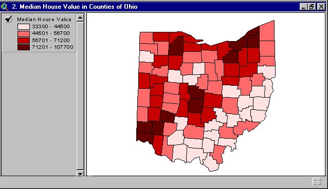
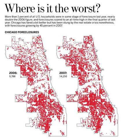
A Statistical map is a special type of map in which the variation in quantity of a factor such as rainfall, population, or crops in a geographic area is indicated. In this type of map, statistical data shows the crime rate in Denver, broken down by county.


Cartogram Map


A Cartogram map is a map in which some thematic mapping variable is substituted for land area. The space of the map is distorted in order to convey the information of this alternate variable. This map is a cartogram map because it shows each state within the United States according to the size of its population rather than its geographic size with the states shape and sizes being distorted to deliver the concept.

Proportional Circle Map


A Proportional Circle map is a map that uses circles to represents data based on the size of the circle. This map is a proportional circle map because it represents population in the state of Georgia based on the different counties in Georgia.

Choropleth Map


A Choropleth map is a type of thematic map in which areas are colored or shaded to reflect the value of the mapped phenomenon or to display classes of values. It is a type of thematic map in which areas are shaded or patterned in proportion to the measurement of the statistical variable being displayed on the map. The choropleth map provides an easy way to visualize how a measurement varies across a geographic area. This map represents a choropleth map because it gives a break-down of Australian Climate classification with the use of colors that represent a varity of climate conditions.

Dot Distribution Maps


A dot-distribution maps is a dot-distribution map that portrays quantitative data as a dot which represents a number of the phenomenon found within the boundary of a geographic area. The pattern of distributed dots reflects the general locations where the phenomenon was most likely to occur. The pattern and number of dots within a geographic area reveal the density of the phenomenon. There are two types of dot-distribution maps, a traditional dot map and an increase/decrease dot map. A traditional dot map shows the distribution of a phenomenon. An increase/decrease dot map shows increasing and decreasing data values as they related to the last agricultural census. This map represents a dot-distribution map using both traditional and increase/decrease dot maps, because it shows the number of Wal-marts throughout the United States as represented by the dots. The dots show the areas where Wal-Marts are highly present versus the areas where Wal-Marts are scarce.


Propaganda Maps


A Propaganda map is a persuasive map that is designed for the purpose of promoting a State or other entity's objectives. This map represents a propaganda map in that the Black Octopus is so avaricious that he stretches out his eight arms in all directions, and seizes up every thing that comes within his reach wants. The Octopus was made by the Japanese as a symbol of foreign aggression.


Hypsometric Maps


A Hypsometric maps represents the elevation of the terrain using colors. The area between two neighboring contour lines receives one specific tint. A map giving elevations by contours, or sometimes by means of shading, tinting, or batching. Hypsometric tinting in maps is often accompanied by bathymetric (the study of underwater depth of lake or ocean floor) tinting in oceans, which indicates depths using a similar method. This map represents a hypsometric map in that it represents different elevations with the use of colors, shading, and tinting. It also shows locations of and depths of oceans with different colors and tinting.

PLSS Map


A Public Land Survey System (PLSS) map is a map that represents ways of subdividing and describing land in the United States. The PLSS is used to divide public domain lands. Pulic domains are lands owned by the Federal government that benefit citizens of the United States. The PLSS typically divides land into 6-mile-square townships, which is the level of information included in the National Atlas. Townships are subdivided into 36 one-mile- square sections. This map represents PLSS in that it shows the subdivision of townships between Missouri, Oklahoma, and Kansas.


Cadastral Maps


A cadastral map is a map that provides detailed information about real property within a specific area. It is a legal map for recording ownership of property. A cadastral map describes boundaries and ownership. This map represents a cadastral map because it gives a breakdown using measurements that represents boundaries and ownership of specific property.


Mental Map


A mental map is a map of the environment as portrayed by the mind of an individual which reflecting the knowledge and prejudices of that individual. This mental map reflects the person's perceptions of, and preferences for, different places and is the result of the way in which an individual acquires, classifies, stores, retrieves, and decodes information about locations. Mental maps may also include images of locations. This map represents a mental map because it mentally describes a part of a city as related to location of streets, buildings, rivers, and states.


Topographic Map


A Topographic Map is a map that includes contour lines that are drawn to represent changes in elevation. When you follow a path on a topographic map that crosses these contour lines, you will be either climbing or descending. This map represents a topographic because it represents elevation from approximatley 4300 to 5117.


Planimetric Map


A Planimetric Map is a map that indicates only horizontal positions of features, without regard for elevation. It's a digital graphic map that portrays horizontal positions using lines and symbols. This map represents a planimetric map because it is made up of flat horizontal lines with the use of symbols.


Sunday, April 18, 2010

Population Profile Map


A population profile map is a map that presents a graphic overveiw of demographic statistics. This is a population map because it breaks down the number of women to men for each age group in Mobile county.


Scatter Plot Map


Scatter Plot maps a good maps for examining large data sets. It is a great visualization map when looking for positive and negative correlation, trends, and statistical data. This map is a representation using two different variables, data set 1 and data set 2, representing a negative correlation.


Bilateral Graph Map


A Bilateral Graph map is a map that shows two different variations in a visual form. This map represents a bilateral graph in that it compares three different variables with some overlapping.


DOQQ Maps


Digital Orthophoto Quater Quads (DOQQ) are digital images that contain orthorectified aerial photography at a resolution of 1 meter. A DOQQ is a uniform scale photography image that makes it possible to determine map measurements. Features are represented in their true ground position making direct measurements possible. This map of Minneapolis, MN is a DOQQ that is a computer generated aerial photograph. It shows a large area of the city with great resolution.


DEM Map


A Digital Elevation Model (DEM) map is a digital representation of ground surface shape and features. DEMS are often used in geographic information systems (GIS) and are the common basis for digitally produced relief maps. This map of Oregon is a DEM relief map because it shows different elevations, shapes, and features of the land represented by the different ridges.


Sunday, April 11, 2010

Lidar Maps


A Lidar Map image uses light detection and ranging to collect topographic data. This map is a map of Kiawah Island, South Carolina. This map represents a Lidar Map because it shows different surfaces of the earth on the island. The color bar is used to highlight relatively narrow variations in elevation.

http://www.csc.noaa.gov/products/sccoasts/html/images/oldlg.gif

Isobars


Isobars are lines on a map connecting points having equal barometric pressure at a reference altitude at a certain time or period of time. It is used to show different pressures on a map. High pressure cells are shown as H's and Low pressure cells as L's. This map of Europe and the Mediterranean is an isobar because it shows the high pressure zones greater that 1015 hectopascals.