An Accumulated Line graph (Lorenz curve) are line graphs that are "stacked" on top of each other. The graph can a representation of wealth. Lorenz curve shows the degree of inequality that exists in the distributions of two variables, and is often used to illustrate the extent that income or wealth are distributed unequally in a particular society. This map shows household income and spending.
Tuesday, April 20, 2010
Parallel Coordinate Graph
A Parallel Coordinate Graph is a graph that attempts to show multivariate structure of data by plotting all variables simultaneously. This is done by plotting each variable on a vertical axis, and then connecting together all points on the axes that correspond to a line as evident by this chosen graph.
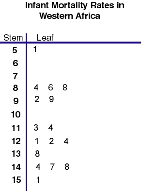
Stem and Leaf Plot Map
A Stem and Leaf Plot is a type of graph similar to a histogram but shows more information. The Stem-and-Leaf Plot summarizes the distribution of data and provides extra detail regarding individual values. The data is arranged by place value. The digits in the largest place is referred to as the stem and the digits in the smallest place are referred to as the leaf. The leaves are always displayed to the left of the stem. This map is evident of a stem and leaf plot in that it has all its stems listed on the left and leaves listed on the right.
Similarity Matix
A Similarity matrix is a matrix of scores which express the similarity between two data points. Similarity matrices are related to their counterparts, distance matrices, and substitution matrices. This map is a similarity matrix because it brings different strains of bacteria together that resemble each other.
Dopplar Radar Map
A Dopplar Radar map is a map of the weather radar system that employs the apparent shift in frequency of radio waves to perceive air motion and consequently predict tornadoes and precipitation sooner than previous radars. It also measures the speed and direction of rain and ice. This map is a dopplar radar map because it shows movement of weather (Tropical Storm Alberto) across a region.
Correlation Matrix Maps
A Correlation Matrix graph is a graph that gives the correlations between all pairs of data sets.
In statistics, correlation and dependence are any of a broad class of statistical relationships between two or more random variables or observed data values. This map represents a correlation matrix because the correlation between two different sets of variables is shown. This map is a calculated protein correlation matrix in which the behaviors range from high (red) to low (blue).
Box Plot Maps
a box plot or boxplot (also known as a box-and-whisker diagram or plot) is a convenient way of graphically depicting groups of numerical data through their five-number summaries. This box plot is a box plot because it consists of one or more box symbols that summarizes the distribution of the data within one or more data sets. A Box Plot chart displays a rectangle with whisker lines extending from both ends.
Subscribe to:
Posts (Atom)